Theme Customizer
RT-Theme 20 uses the WordPress Customizer for its settings. You see your changes in a live preview as you make them. You can open the Customizer in two ways:
- Go to Appearance › Customize.
- Go to RT-Theme 20 › Customize, in the theme’s own admin menu.
Both ways open the same screen, where you adjust the theme settings visually:
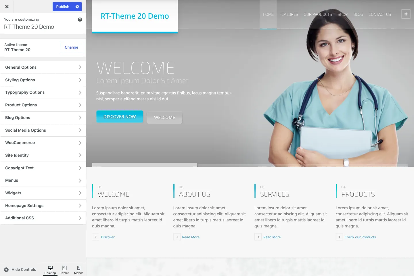
You change the settings on the left and see the result in the preview on the right (on the left in right-to-left languages).
Customizer menu
Section titled “Customizer menu”The Customizer groups the theme settings into panels and sections.
- To change settings, open one of the panels.
- An arrow pointing right means the item opens a sub-menu with more options.
- To save your changes, click Publish.
- To leave the Customizer, click the close button at the top left (top right in right-to-left languages). Changes you have not published are lost.
Active area indicator
Section titled “Active area indicator”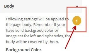
While you work in the Customizer, you may see a yellow flash icon next to a setting. Click it, and a flashing overlay in the preview shows which part of the page the setting changes. If nothing flashes, the area is outside the visible part of the preview: scroll the preview to see it.
Theme settings import, export and reset
Section titled “Theme settings import, export and reset”The theme settings themselves can be saved to a file and restored under RT-Theme 20 › Customizations:
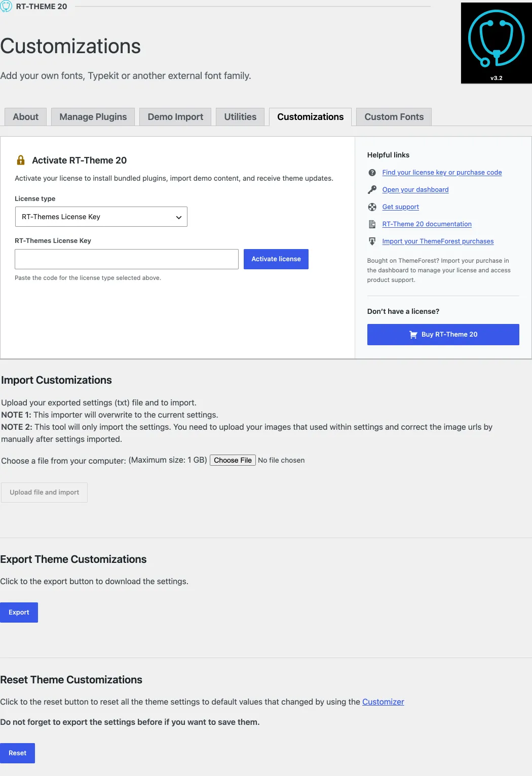
- Import Customizations: upload a
txtsettings file that you exported before. On a WordPress Multisite network, allow uploads of thetxtfile extension in the network settings first. - Export Customizations: download the current theme settings as a
txtfile. - Reset: set all theme settings back to their defaults.
Customizer and child themes
Section titled “Customizer and child themes”A child theme has its own Customizer settings, because WordPress stores them per theme. You export your settings in the parent theme and import them in the child theme on the same RT-Theme 20 › Customizations page (see Theme settings import, export and reset). If you do not import them, reset the settings there after you activate the child theme. Otherwise your pages do not look right on your site. The full explanation is in Child themes and Customizer settings. The package includes a ready-made child theme, rt-theme-20-child.zip.
General Options
Section titled “General Options”The General Options panel holds the site-wide basics.
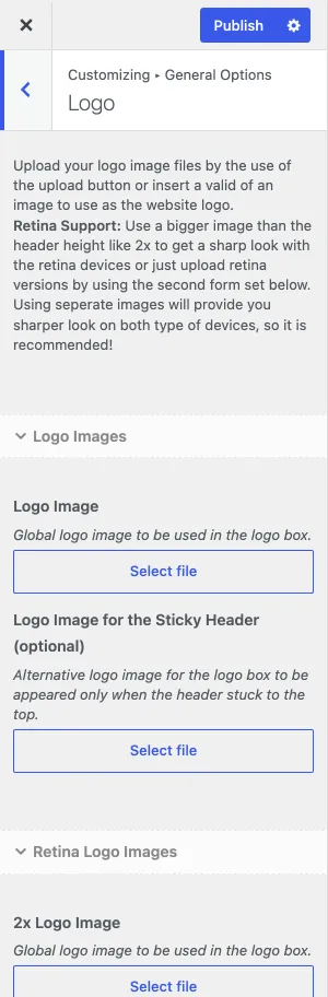
- Logo Image: upload your logo.
- Logo Image for the Sticky Header (optional): a different logo for the header after the page is scrolled.
- Retina Logo Images: upload each logo again at twice the size for sharp logos on high-resolution screens.
The favicon is the WordPress Site Icon, under Site Identity.
Performance
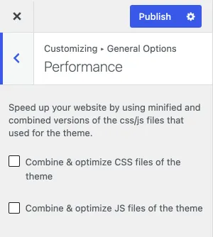
Section titled “Performance”- Load the combined and optimised CSS files of the theme.
- Load the combined and optimised JS files of the theme.
Breadcrumb menus
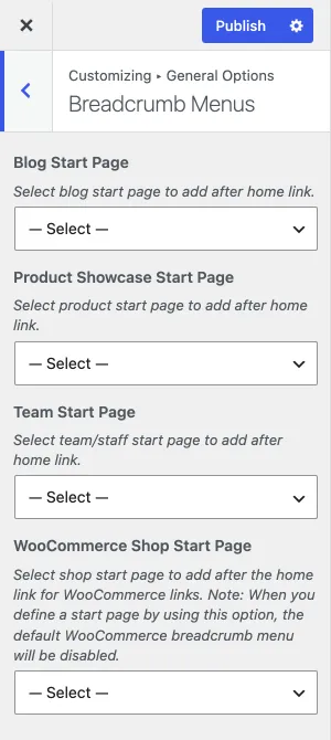
Section titled “Breadcrumb menus”Choose a page that the breadcrumb path shows before a single post. You can set one for the theme’s built-in post types: the blog, Product Showcase, Team and the WooCommerce shop. Only these post types have this setting.
Sidebar options
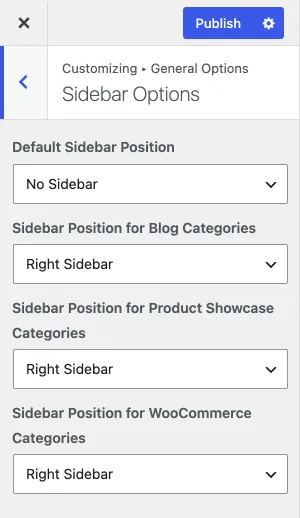
Section titled “Sidebar options”Set the default sidebar position (left or right) for:
- pages and posts;
- blog categories;
- Product Showcase categories;
- WooCommerce categories.
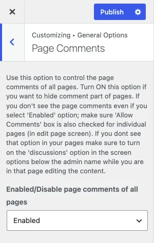
Page comments
Section titled “Page comments”By default, WordPress shows comments on posts but not on pages. This setting turns on comments for all pages.
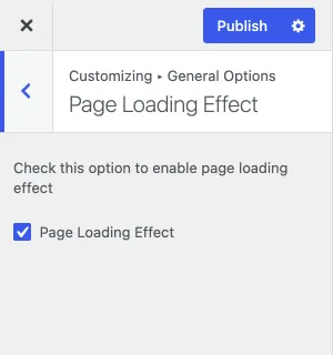
Page loading effect
Section titled “Page loading effect”Turn the full-screen loading animation on or off for all pages of your site.
Go to top button and Google Maps
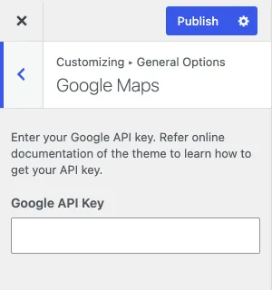
Section titled “Go to top button and Google Maps”Go to Top Button shows or hides the button that takes visitors back to the top of the page. Google Maps holds the Google API Key field for your maps; see Google Maps.
Styling Options
Section titled “Styling Options”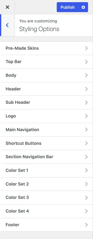
- Pre-Made Skins: activate one of the preset skins that come with the theme.
- Top Bar: the bar above the header.
- Body: the body background. If your content rows are full width, the body is not visible.
- Header: the header bar with the logo and the navigation.
- Sub Header: the area with the page title and the breadcrumb menu.
- Logo: the logo box or the logo font, on all devices.
- Main Navigation: every colour of the main navigation.
- Shortcut Buttons: the icons at the top right of the page. Turn them on or off and change their style.
- Section Navigation Bar: the numbered bar at the top of a single product page, as on this sample product.
- Color Sets: colour schemes for content rows and columns, so that each block can look different. There are four; the first is the theme’s default. Nested rows with different colour sets can behave unexpectedly, see Colour sets in nested rows and columns.
- Footer: the footer area.
Typography Options
Section titled “Typography Options”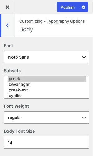
The Typography Options panel has sections for the body text, the headings, the main menu on desktop and on mobile, and a few other areas of the theme. For example, to change the global body font size, open Body and change the settings there. Each section has:
- Font family: click the list to browse and select a font.
- Subsets: hold Ctrl while you click to select or deselect one or more subsets.
- Font weight: Thin (200), Normal (400), Thick (600), Thicker (700), Bold (800/900) or Italic.
- Font size in pixels.
Custom fonts
Section titled “Custom fonts”The font list contains web-safe fonts and Google Fonts by default. To add your own font to the list, use RT-Theme 20 › Custom Fonts.
Product Options
Section titled “Product Options”The Product Options panel controls the Product Showcase pages:
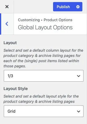
- Global Layout Options: the column layout and the layout style (grid or masonry) of the product category and archive pages.
- Listing Parameters: the number of items per page and the sort order.
- Category Display Options: how product category pages show the category description and subcategories.
- Currency Options: the currency symbol, its position and where the price shows.
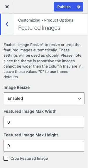
- Featured Images: whether images are resized and cropped, and their size.
Global layout options
Section titled “Global layout options”- The default column layout of the product category and archive pages.
- The default layout style of those pages: grid or masonry.
Listing parameters
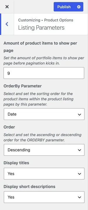
Section titled “Listing parameters”- The number of products per listing page. Do not show too many products on one page, or it loads slowly.
- The parameter to sort by: author, date, title, modified date, ID or random.
- The sort order: ascending or descending.
Currency options
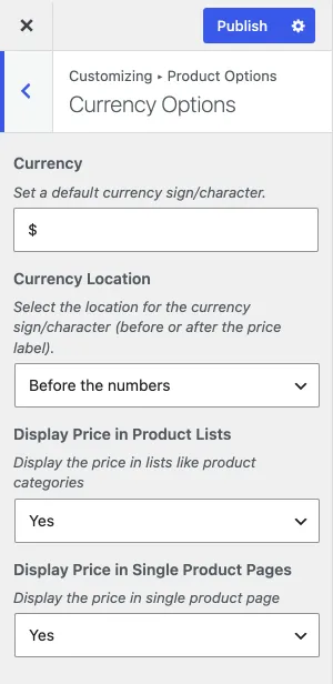
Section titled “Currency options”- The currency symbol.
- The position of the currency symbol: before or after the amount.
- Whether the price shows on product listing pages.
- Whether the price shows on single product pages.
Featured images
Section titled “Featured images”- Resize the featured images on listing pages, or not.
- The maximum width in pixels.
- The maximum height in pixels.
- Crop the featured image, or not.
Blog Options
Section titled “Blog Options”The Blog Options panel has these sections:
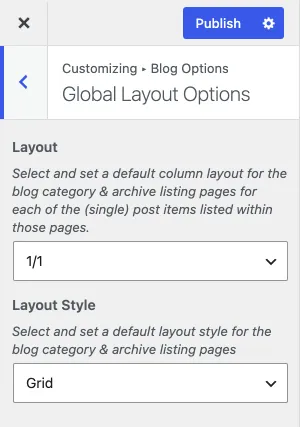
- Global Layout Options: the column layout and layout style (grid or masonry) of the blog category and archive pages.
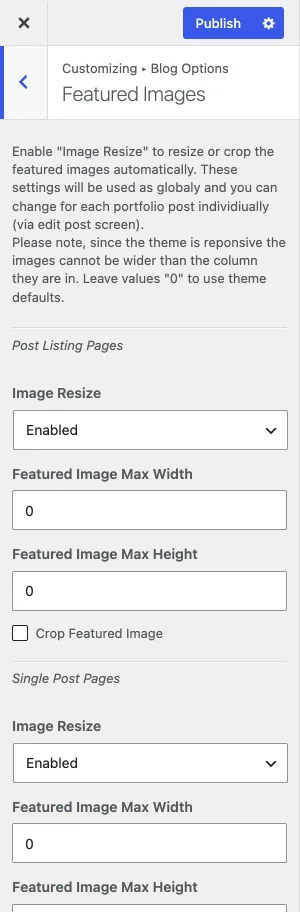
- Featured Images: resizing, cropping and size.
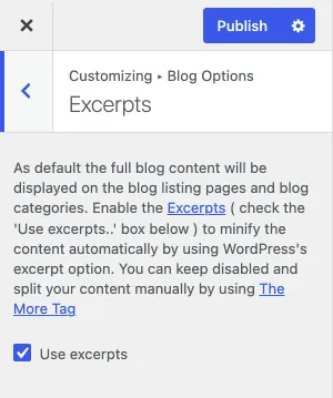
- Excerpts: use excerpts, or turn them off and use more tags.
- Post Meta: which meta information shows on the blog listing pages and single posts.
- Single Post Page: the blog name, the default title in the header area of single blog posts.
Global layout options
Section titled “Global layout options”- The default column layout of the blog category and archive pages.
- The default layout style of those pages: grid or masonry.
Featured images
Section titled “Featured images”- Resize the featured images on listing pages, or not.
- The maximum width in pixels.
- The maximum height in pixels.
- Crop the featured image, or not.
Excerpts
Section titled “Excerpts”Choose whether blog lists use excerpts or more tags.
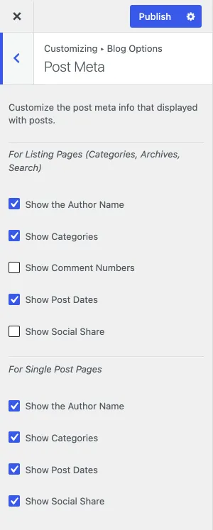
Post meta
Section titled “Post meta”Choose which meta information shows:
- on blog listing pages: the author name, categories, number of comments and post date;
- on single blog posts: the author name, categories and post date.
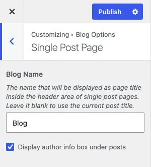
Single post page
Section titled “Single post page”Set a default title for all single blog posts. If you leave it empty, the post’s own title shows instead.
WooCommerce Options
Section titled “WooCommerce Options”The theme’s WooCommerce panel has three sections:
- Global Layout Options: the column layout of the product category and archive pages.
- Listing Parameters: the number of products per page.
- Single Product Page: the product image gallery and the related products.
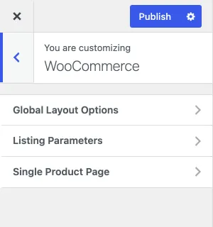
Global layout options
Section titled “Global layout options”Set the default column layout of the product category and archive pages.
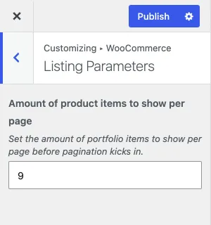
Listing parameters
Section titled “Listing parameters”Set how many products show per page before the pagination starts. Drag the slider left or right to lower or raise the number, or type it in the field.
Featured images
Section titled “Featured images”The theme’s WooCommerce panel has no featured image settings. WooCommerce sets the product image sizes itself, under its own Product Images settings in the Customizer.
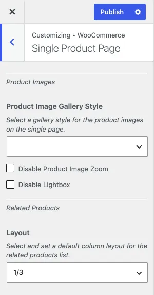
Single product page
Section titled “Single product page”Under Product Images, you can set:
- the gallery style of the product images on the single product page;
- whether the product image zoom is turned off;
- whether the lightbox is turned off.
Related products
Section titled “Related products”Under Related Products in the same section, set the default column layout of the related products list on single product pages.
Social Media Options
Section titled “Social Media Options”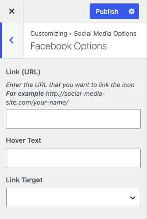
The Social Media Options panel holds about 42 social icons. Under Visibility you choose where the icons show on your site.
Settings per social icon
Section titled “Settings per social icon”For each social icon you can set:
- Link (URL): the page that opens when someone clicks the icon.
- Hover Text: the text that shows when the mouse is over the icon.
- Link Target: open the link in the same window or in a new tab.
Site Identity
Section titled “Site Identity”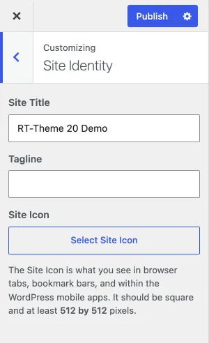
- Site Title: the name of your site.
- Tagline: the subtitle of your site.
- Site Icon: the favicon shown in browser tabs.
Click Publish to save your changes.
Copyright text
Section titled “Copyright text”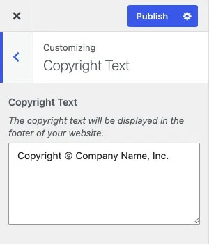
The Copyright Text section has one setting: the text that shows in the copyright area of the footer.
Widgets
Section titled “Widgets”In the Widgets panel:
- Use the left arrow to go back to the main Customizer menu.
- Click Publish to save your changes.
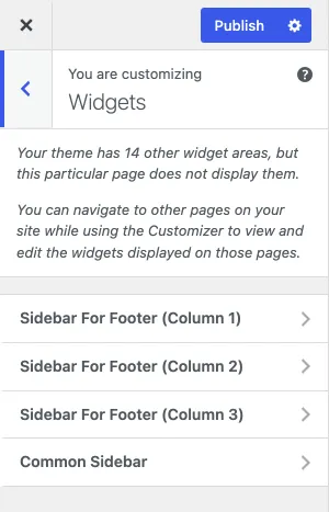
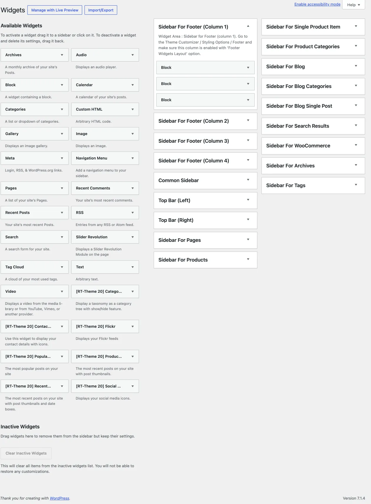
The Customizer lists the widget areas that appear on the page shown in the preview, for example Footer Column 1 to Footer Column 4 and the Common Sidebar. You edit all widget areas under Appearance › Widgets.
Adding widgets in the Customizer
Section titled “Adding widgets in the Customizer”-
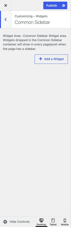
Open a widget area and click Add a Widget. A list of widgets opens next to the button. Search for a widget, or pick it from the list.
-
The widget is added to the area you started from, and its options appear. Set them the way you want the widget to work.
-
Click Publish.
Where the widget areas show
Section titled “Where the widget areas show”The theme has widget areas for different kinds of pages, such as Pages, Blog, Products and Common Sidebar. They show in the page’s sidebar, on the side you set in Sidebar options. The Common Sidebar shows last.
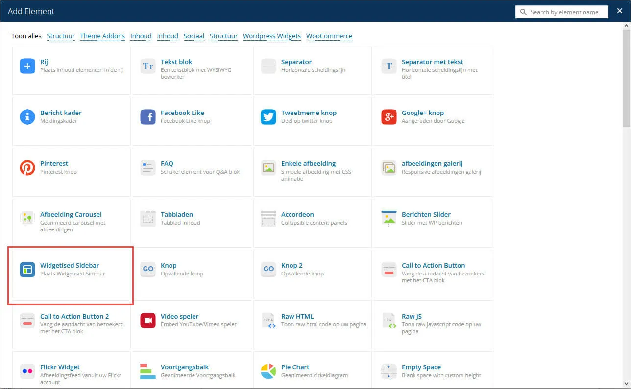
You can also show any widget area in any column of a page: add the Widgetised Sidebar element with WPBakery Page Builder.
In this example page sidebar:
- the widget area for pages;
- the Common Sidebar.
Creating widget areas
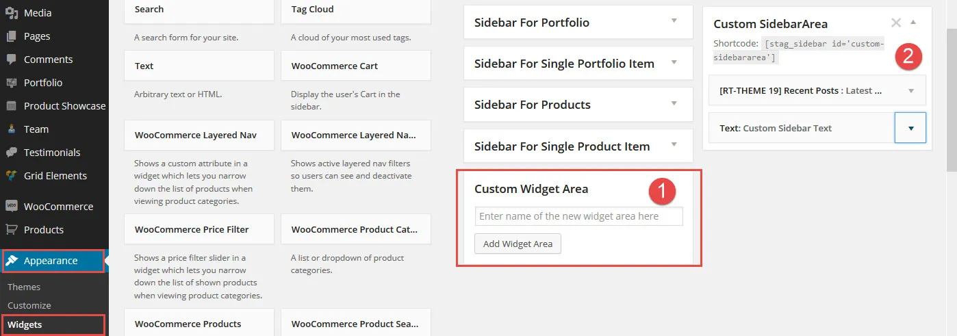
Section titled “Creating widget areas”To create new widget areas, you need a plugin, such as Stag Custom Sidebars or Custom Sidebars. Once you have created an area, go to Appearance › Widgets and add widget blocks to it.
Creating a page with a sidebar in the content area
Section titled “Creating a page with a sidebar in the content area”- Create a widget area with one of the plugins above. Their documentation explains how they work.
- Add widgets to the area, so that it has content.
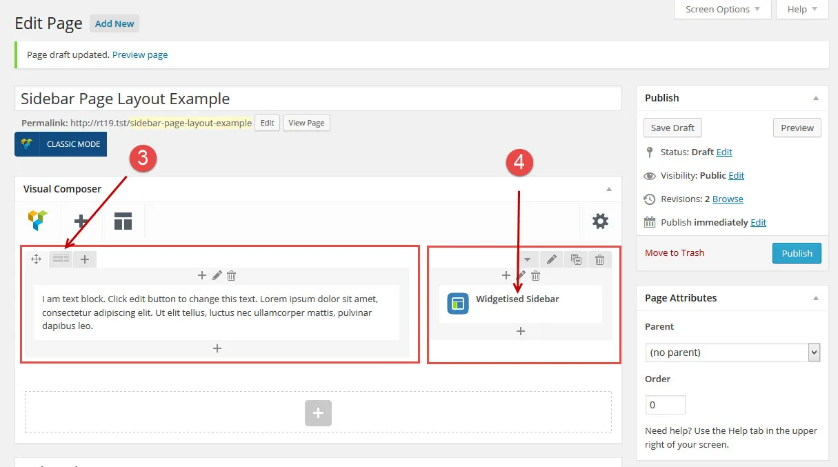
- Create a page and, in WPBakery Page Builder, split the content area into columns, for example 2/3 and 1/3.
- In the 2/3 column, add a text block or any other content.
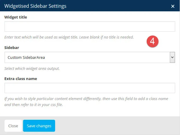
- In the 1/3 column, add a Widgetised Sidebar element and select your widget area.
Homepage settings
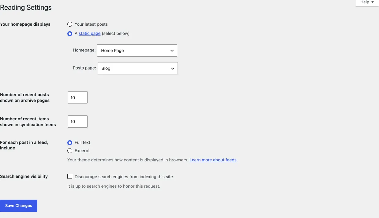
Section titled “Homepage settings”The Homepage Settings section of the Customizer, the same settings as Settings › Reading, sets which page is your home page and, optionally, which page lists your blog posts. How these settings work is explained in Homepage and blog page.
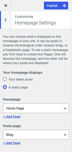
In RT-Theme 20:
- Homepage: any page can be your home page, the page visitors land on.
- Posts page: you do not need to set it.
The same choice is under Settings › Reading: