
Navigations
Menu locations
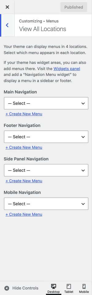
Section titled “Menu locations”Ava has four menu locations:
| Location | Where it shows |
|---|---|
| Main Navigation | The main menu, used by every header design of the theme |
| Mobile Navigation | The menu on mobile screens only. If you leave it empty, the main navigation is used as the mobile menu |
| Side Panel Navigation | The menu inside the side panel |
| Footer Navigation | The menu above the copyright text in the footer |
When you activate the theme, these locations are created for you, so you can skip the “create a menu” step. If you already have a menu, assign it to a location in the Manage Locations tab, or in the Customizer under Menus › View All Locations.
Managing navigation menus
Section titled “Managing navigation menus”-
Go to Appearance › Menus and select the menu you want to edit.
-
Use the left column of the page to add new items to the menu.
-
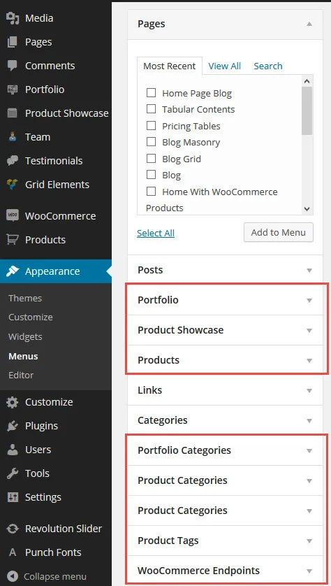
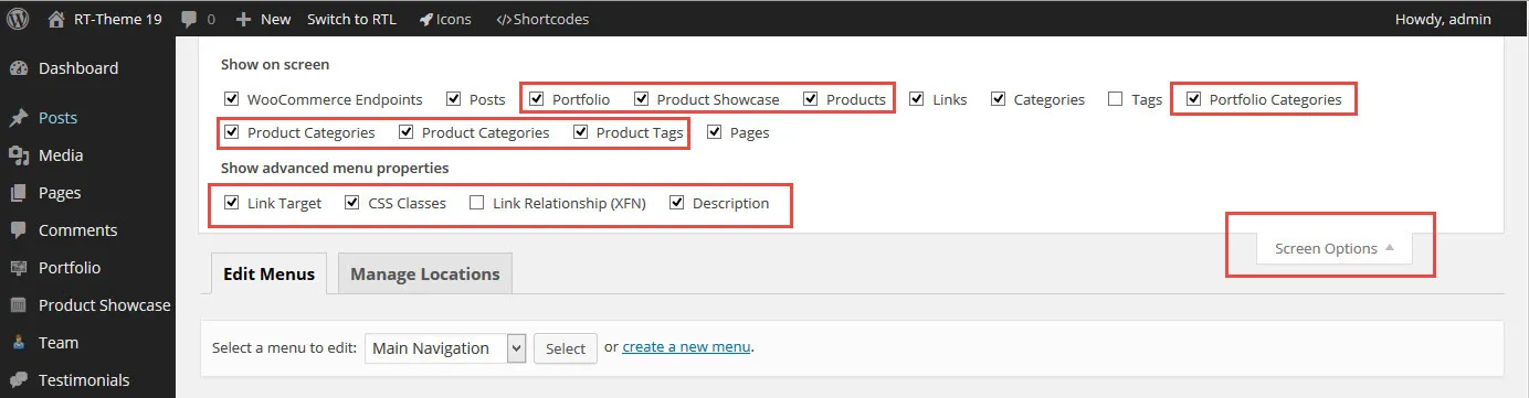
Custom post types such as Portfolio, Team, Testimonials and WooCommerce products are not in the list of available items by default. Turn them on in Screen Options, at the top right of the screen:
Editing menu items
Section titled “Editing menu items”When these fields are visible in a menu item, you can:
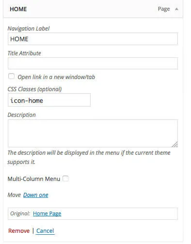
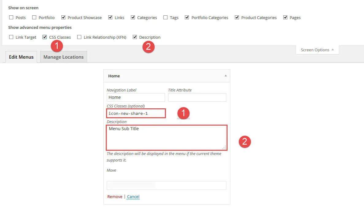
- Add an icon. Expand a menu item and click the CSS Classes field. A list of available icons appears; pick one. To see the field, turn on CSS Classes in Screen Options.
- Add a subtitle. Type a short text in the Description field: it shows below the label of the menu item. To see the field, turn on Description in Screen Options.
- Split the submenus into columns with the Multi-Column Menu option.
Mobile navigation
Section titled “Mobile navigation”The mobile navigation is not the same as the menu you see when you make your browser window smaller on a computer. The mobile menu looks different from the desktop version, and some settings, such as icons, don’t show in the mobile view. To show a different menu than the main menu on mobile screens only, assign it to the Mobile Navigation location.
WordPress menus
Section titled “WordPress menus”Using WordPress menus
Section titled “Using WordPress menus”WordPress lets you build your own navigation menus. You create a menu, add items to it and assign it to one of the theme’s locations. For example, you create a menu called “My main navigation” and assign it to the Main Navigation location. Your menu then shows where the theme places the main navigation. The general steps are in Creating menus; the rest of this section covers what is specific to Ava.
Menu subtitles
Section titled “Menu subtitles”Ava supports subtitles in the Main Navigation location. Add the subtitle in the Description field of the menu item. If you don’t see the field, open Screen Options at the top right of the screen and turn on Description. The field then appears in every menu item.
Default menus
Section titled “Default menus”Ava creates these menus for you:
- Main Navigation Menu for the main navigation location.
- Footer Navigation Menu for the footer navigation location.
You can create your own menus, name them as you like and assign them to the theme’s locations. You can also assign one menu to several locations. Not every location supports submenus the way the main location does: the footer location shows only top-level items and no dropdown menus.
The mobile navigation works differently from a narrow desktop window, as explained in Mobile navigation.
Where to find the menus
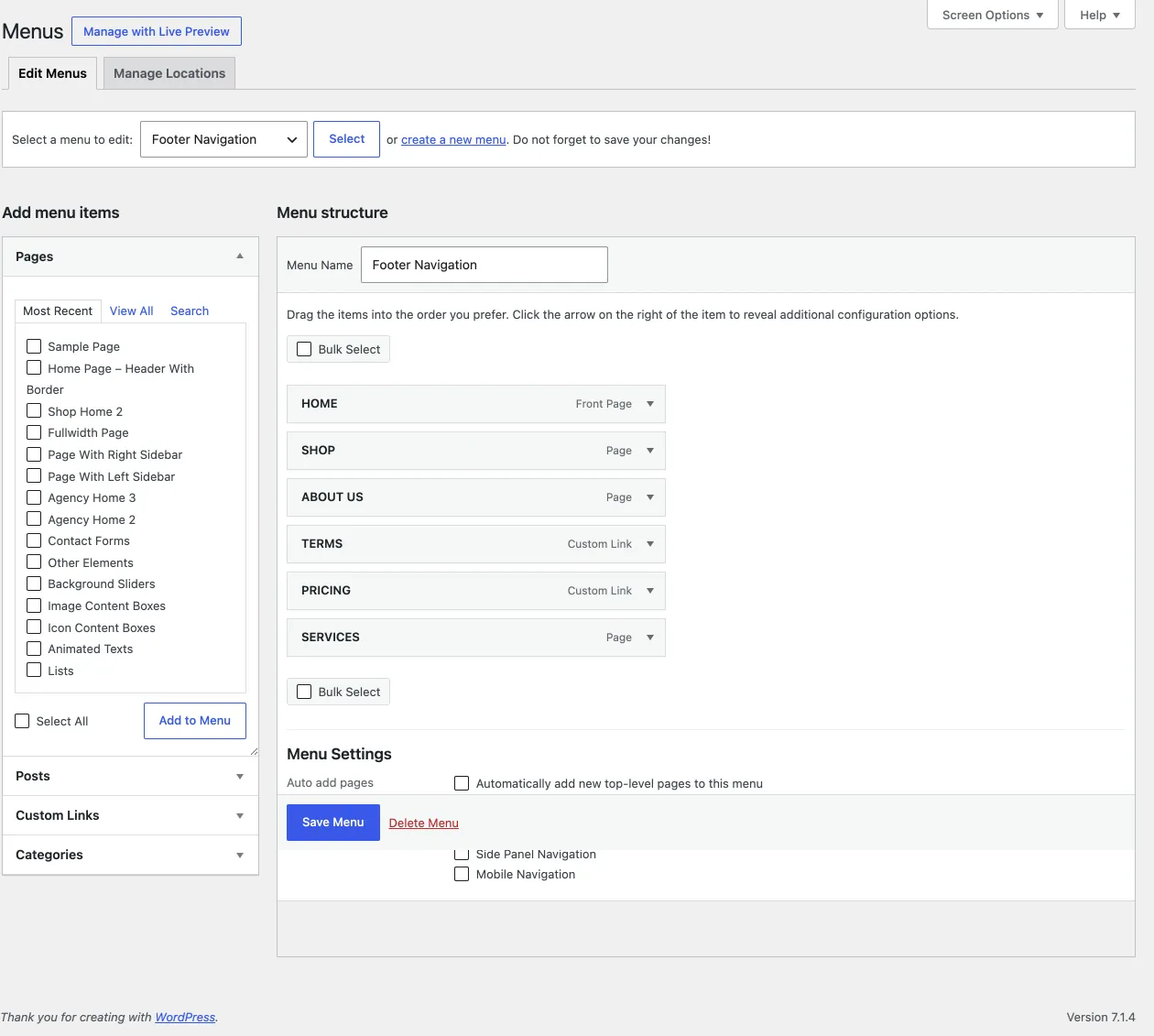
Section titled “Where to find the menus”Go to Appearance › Menus.
Building a navigation menu
Section titled “Building a navigation menu”- On the Edit Menus tab, select Main Navigation Menu from the dropdown and click Select. You can also click create a new menu next to it.
- The left column lists your pages, posts, portfolio items, categories and other content. The right column shows the menu and its items.
- Select items on the left and click Add to Menu. They appear in the menu on the right.
- Each menu item has settings: the navigation label, the title attribute (the text you see when you hover the item), the description, and CSS classes that experienced users can target with custom CSS. If you don’t see these settings, turn them on in Screen Options at the top right of the screen.
- Drag the items to reorder them. To make an item a submenu item, drag it to the right, below another item.
- Under the menu items, the theme’s Menu Settings list the display locations. Select a location for your menu, otherwise it does not show on your site.
- Click Save Menu and visit your site to see the result.
Adding an icon or a subtitle
Section titled “Adding an icon or a subtitle”- For an icon, click in the CSS Classes field of the menu item. A popup with the available icons appears. Select one.
- For a subtitle, type any text in the Description field.
Showing categories in the menu editor
Section titled “Showing categories in the menu editor”If you don’t see portfolio, product or post categories in the left column:
-
Open Screen Options at the top right of the screen.
-
Turn on the post, product and portfolio categories. They then appear in the left column and you can add them to your menu.
Adding a home page or a custom link
Section titled “Adding a home page or a custom link”- Open the Custom Links box in the left column.
- Type the URL of your home page, or of any other page, in the URL field.
- Type the label, such as “Home”, in the Link Text field.
- Click Add to Menu.
- Drag the new item to its place in the menu and adjust its settings if you like.
- Save the menu.
Video tutorials
Section titled “Video tutorials”There are many good videos about the WordPress menu system on YouTube. Search for “WordPress menus” to see how it works.
Multi-column navigation (mega menu)
Section titled “Multi-column navigation (mega menu)”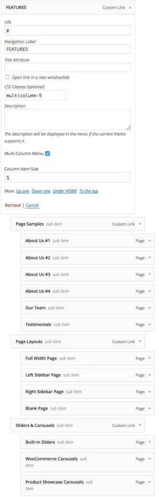
To create a multi-column dropdown menu, check Multi-Column in a menu item. It works only on top-level items. When you check the box, the submenu items are split into columns. The screenshot shows the “Features” menu of our demo site: we placed the third-level items under five second-level items. A second-level item becomes a section title when it has a submenu. In the mobile menu, multi-column menus show as regular menus.