
Navigations
Menu locations
Section titled “Menu locations”RT-Theme 19 shows your menus in up to five places on your site. You build the menus under Appearance › Menus and assign each one to a location. The theme has five menu locations:
- Main Navigation: the main menu. Every header layout uses it.
- Second Main Navigation: the menu on the left side of the logo. Only header Layout 4 (Centered Logo) uses it.
- Mobile Navigation: the menu for mobile screens only. If you leave it empty, the theme uses the Main Navigation menu on mobile screens.
- Side Panel Navigation: the menu inside the side panel.
- Footer Navigation: the menu next to the copyright text in the footer.
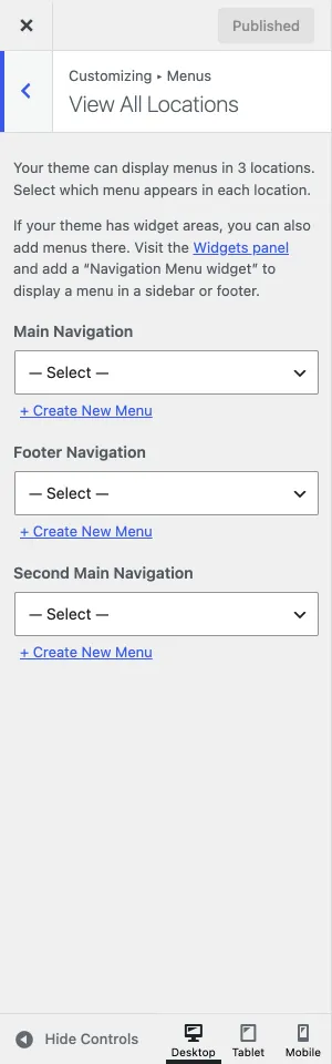
RT-Theme 19 creates these locations when you activate it, so you can skip creating them yourself. If you already have a menu, assign it to a location on the Manage Locations tab of Appearance › Menus, or in the Customizer under Menus › View All Locations. The Customizer lists only the locations that the current header layout uses.
Managing navigation menus
Section titled “Managing navigation menus”How to create a menu, add pages, posts and custom links, and reorder the items is explained in Creating menus. In short:
- Go to Appearance › Menus and select the menu you want to edit.
- Use the panel on the left of the screen to add items to the menu.
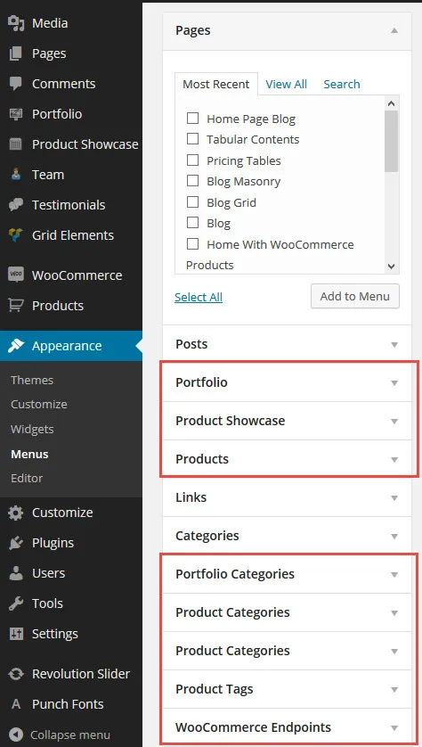
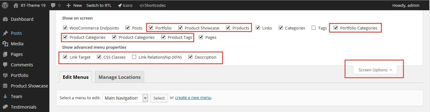
- The theme’s own content types, such as Product Showcase, Team and Testimonials, and WooCommerce products are hidden from that panel at first. Open the Screen Options tab at the top right of the screen and select them.
Editing menu items
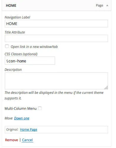
Section titled “Editing menu items”First open Screen Options at the top right of Appearance › Menus and select CSS Classes and Description. These fields then appear in each menu item. Expand a menu item to:
- Add an icon. Click the CSS Classes field. A list of the available icons appears; pick one, and its class name, such as
icon-home, is added to the field. - Add a subtitle. Type a short text in the Description field. It shows below the menu item’s label.
- Split a submenu into columns. Select Multi-Column Menu. See Multi-column navigation below.
Mobile navigation
Section titled “Mobile navigation”The mobile menu is not the same as the menu you see when you make your browser window narrow on a computer. It looks different from the desktop menu, and some settings, such as icons, do not show in it. If you want a different menu on mobile screens only, assign it to the Mobile Navigation location.
Multi-column navigation (mega menu)
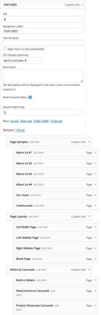
Section titled “Multi-column navigation (mega menu)”You can turn a dropdown menu into a multi-column menu. Each menu item has a Multi-Column Menu checkbox. It works for top-level items only. When you select it, the item’s submenu is split into columns.
The screenshot from our demo site shows the Features menu. It collects third-level items under five second-level items. A second-level item that has its own submenu becomes a column title.
On mobile screens, multi-column menus show as regular menus.