
Block Styles
A block style is another look for a WordPress block: the block and its content stay the same, only its design changes. Furnica and its RT-Themes Blocks plugin add styles to many core blocks.
Pick a block style
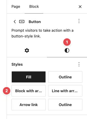
Section titled “Pick a block style”- Select the block in the editor.
- In the block sidebar, open the Styles tab (the half-filled circle, 1).
- Under Styles, click a style (2). The first style is the block’s default look; click it to go back.
Furnica’s patterns already use these styles. If a block in a pattern looks special, select it and check its Styles tab to see which style it uses.
To change a style’s colours or type for the whole site, go to Appearance › Editor › Styles › Blocks and open the block.
Sections
Section titled “Sections”For Group, Columns and Column blocks:
| Style | Look |
|---|---|
| Cream section, Grey section, Yellow section, Dark section | A background colour with matching text, link and button colours. The colours follow the style variation you picked. |
| Circle band | A large, light circle behind a full-width section (hidden on small screens) |
| Divided (Group with a grid) | Thin lines between the cells of a grid |
| Dashes (Group with a row) | A dash between items, for meta rows such as date - author - category |
| Offset block and dots, left / right | A cream block and a dotted pattern behind the group’s photo |
| Image number | A square frame with a large number filled with a photo, such as “40 years” |
| Linked tile (also on Cover) | The link in the tile’s heading covers the whole tile, and the photo zooms in slightly on hover |
| Corner band (Columns) | A grey band behind the second column |
The Post card, Product card and Team card styles draw the cards inside Furnica’s post, product and team patterns.
Text and headings
Section titled “Text and headings”| Block | Styles |
|---|---|
| Heading | Marker (a highlighter bar under the last line), Frame left and Frame bottom (an accent half frame), Ring bullet (a line and a ring before the heading) |
| Paragraph | Long arrow (a paragraph holding one link shows a thin arrow instead of its text), Price (a price with a small currency sign) |
| List | Checks, Chevrons, Numbered circles, Not included (crossed out, for pricing tables) |
| Quote | Accent line, Plain |
| Read More | Arrow |
| Separator | Reading progress (a bar at the top of the screen that fills as the reader scrolls) |
Buttons, images and icons
Section titled “Buttons, images and icons”| Block | Styles |
|---|---|
| Button | Block with arrow, Line with arrow, Arrow link, Outline (Furnica’s outline is the second Outline in the list; the first is WordPress’s) |
| Image | Circle backdrop and Circle offset (a circle behind a cut-out photo), Blend with background (for white-background product photos on a coloured tile), Video lightbox |
| Gallery | Slideshow: one photo at a time, the next one fades in every few seconds |
| Icon | Circle behind (a cream circle behind the icon); Carousel previous and Carousel next (the arrows of a carousel) |
Video lightbox: link the image to a YouTube or Vimeo video (in the image toolbar, Link). Visitors see a play button on the image, and the video opens over the page.
Navigation and menus
Section titled “Navigation and menus”| Block | Styles |
|---|---|
| Navigation | Dropdown (Furnica’s main menu), Accordion (menus in the mobile panel), Chevrons |
| Submenu | Mega menu: the submenu opens as a wide panel. Add columns, images and text to it with the Menu Content block, see Custom Blocks. |
| Search | Icon, Panel |
| Tag Cloud | Chips |
| Categories, Latest Posts | Chevrons |
Posts, pagination and sharing
Section titled “Posts, pagination and sharing”| Block | Styles and variations |
|---|---|
| Post Template (in a Query Loop) | Carousel: the posts slide sideways with arrows |
| Query Loop | Post Carousel and Related Posts Carousel variations, in the inserter |
| Pagination | Squares, Load more (a button that loads the next page of posts in place) |
| Social Icons | Share Links variation and the Share style: buttons that share the current post |
| Comments Form | Two columns |
Accordions and tabs
Section titled “Accordions and tabs”| Block | Styles |
|---|---|
| Accordion | Boxed, Chevron |
| Tabs | Boxed, Strip |
With the Shop feature on:
| Block | Styles |
|---|---|
| Product Template | Spaced columns |
| Product Price | Old price after |
| Product Gallery | Photo boxes; Outlined (its previous and next arrows) |
| Product Filter Chips | Tiles (colour and material swatches) |
| Quantity Selector | Compact |
| Catalog Sorting | Boxed |
| Mini-Cart Contents | Boxed |
| Cart, Checkout | Framed |
Forms and fields
Section titled “Forms and fields”| Block | Styles |
|---|---|
| Contact Form | Accent button, Dark button |
| Field List (Catalog) | Ring rows |
Styles used by the header and footer
Section titled “Styles used by the header and footer”Site header, Header bar, Site footer and Logo mark on Group blocks draw Furnica’s header and footer. Leave them on the blocks they came with. To change the header, see Header and Footer.