Header
Logo sets
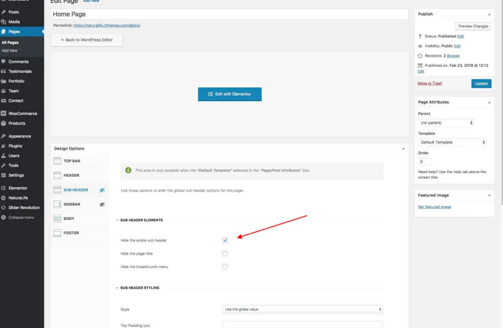
Section titled “Logo sets”NaturaLife has two logo sets, in Appearance › Customize › Logo Sets:
- Dark Logo Set: for the dark header skin.
- Light Logo Set: for the light header skin.
Each logo set holds six logo images: a regular, a sticky header and a mobile header logo, each in a normal and a 2x size. Upload the 2x versions for Retina and other high-density screens. Without them, your logo can look blurry on devices such as recent tablets, smartphones and MacBooks.
Header design
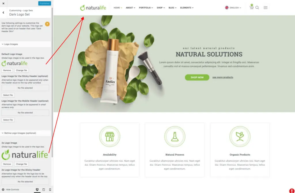
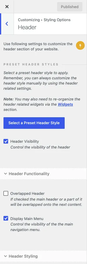
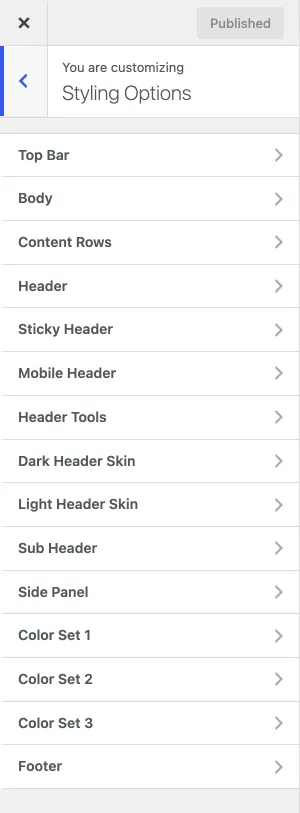
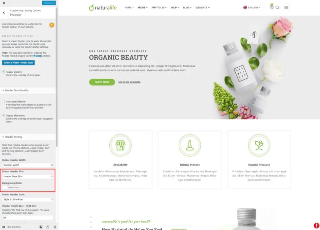
Section titled “Header design”Two main header styles are available: One Row and Two Rows. You can move the header elements around and use the other settings to build your own header. To start from a header layout of the demo, use the header presets. Go to Appearance › Customize › Styling Options › Header to change the global header settings, which apply to every page.
- Click Select a Preset Header Style and choose one of the header styles. Each style also has a transparent version.
- Under Header Styling, choose the Global Header Style: one row or two rows.
- Under Header Item Locations, choose where the logo, the menu and the header tools sit.
Header skins
Section titled “Header skins”The header has two colour sets:
- Dark Header Skin
- Light Header Skin
Both colour sets hold the same settings for the header, such as the text, border and menu item colours. The dark skin uses darker colours, for a dark logo on a light background. The light skin uses light colours on a dark background. The two logo sets follow the same logic and are linked to these colour sets.
For example, the Home Page V demo uses the light header skin. Its header background is set to transparent in the page’s own Design Options, because the header sits over a dark slider image. When you scroll down, the sticky header switches to the dark colour set on a white background.
Use the header skins to change:
- The menu colours
- The submenu colours
- The header line colours
- The header font colours
Open Dark Header Skin or Light Header Skin in Styling Options to change a skin. Choose which skin the header uses in Styling Options › Header, under Global Header Skin.
Header icons
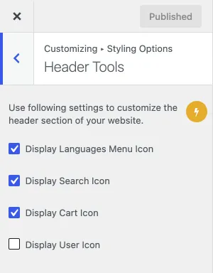
Section titled “Header icons”The header has four tool icons:
- Language Menu Icon: available only when Polylang or WPML is installed.
- Search Icon
- Cart Icon: available only when WooCommerce is installed.
- User Icon: available only when WooCommerce is installed.
Show or hide each header icon in Appearance › Customize › Styling Options › Header Tools.
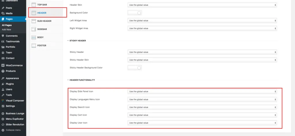
To change the icons for one page or post only, open its Design Options › Header. These settings override the global settings for that page.
Header widgets
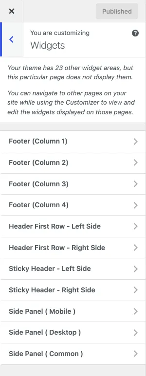
Section titled “Header widgets”The header has four widget areas: Header First Row Left and Right, and Header Second Row Left and Right. The sticky header has two more: Sticky Header Left and Right. These widget areas support only the Text, Social Media Icons, Custom Menu and Custom HTML widgets. Other widgets can break the header design, so only use them if you know what you are doing.
Sub header
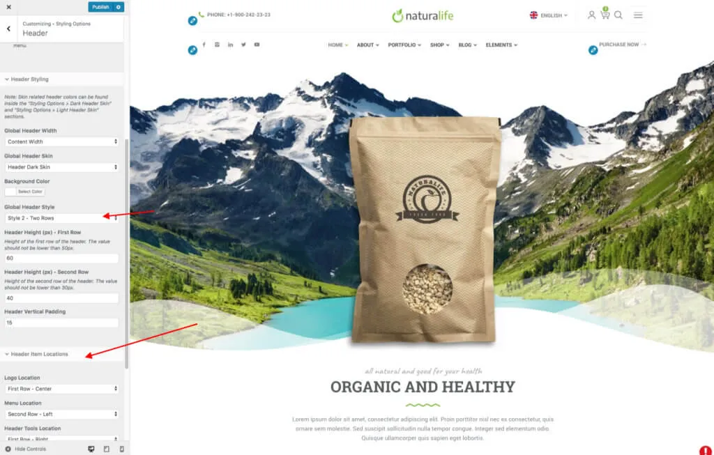
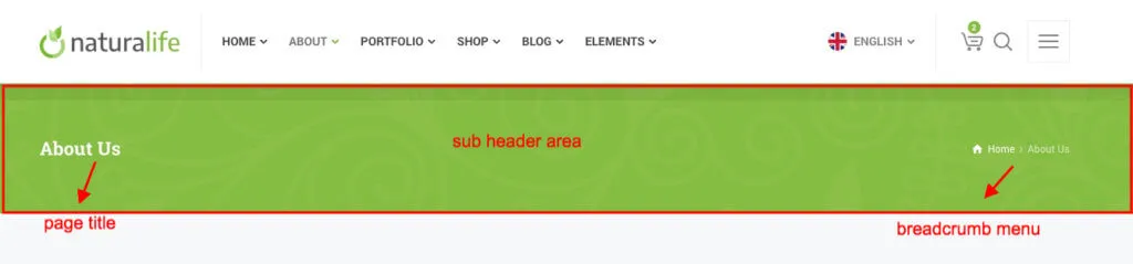
Section titled “Sub header”By default, every page shows the sub header. The sub header holds two elements: the page title and the breadcrumb menu. You can turn these elements off for the whole site in Appearance › Customize › Styling Options › Sub Header.
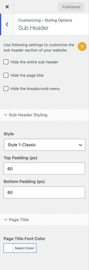
To turn them off for one page or post only, open Design Options › Sub Header on the page or post edit screen. These settings override the global settings. When you tick Hide the entire sub header, the page shows no sub header at all, as on the demo home pages.