Side Panel
Side panel and mobile menu
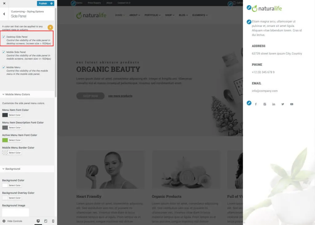
Section titled “Side panel and mobile menu”The side panel slides in from the right when a visitor clicks the menu icon in the header. It works on both desktop and mobile screens. On desktops it can hold extra content, such as your contact details. On mobile screens it also holds the mobile menu. You control the side panel and the visibility of its menu icon in Appearance › Customize › Styling Options › Side Panel.
Side panel on desktop screens (wider than 1024px)
Section titled “Side panel on desktop screens (wider than 1024px)”Turn on Desktop Side Panel in Appearance › Customize › Styling Options › Side Panel.
Mobile menu and side panel on mobile screens (up to 1024px)
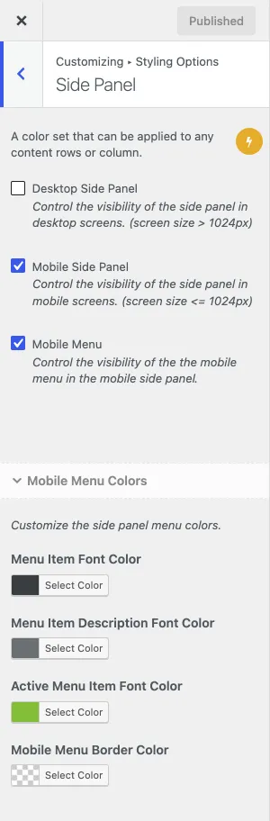
Section titled “Mobile menu and side panel on mobile screens (up to 1024px)”The mobile menu is part of the side panel. On mobile screens, the side panel shows the Main Navigation menu automatically. To show a mobile menu, make sure both Mobile Side Panel and Mobile Menu are ticked.
Custom mobile menu
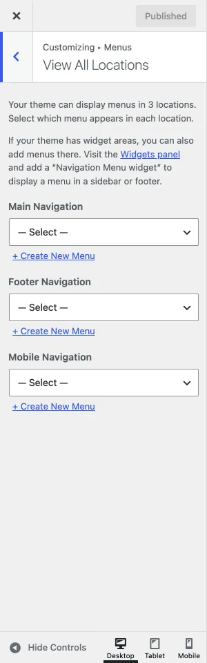
Section titled “Custom mobile menu”To show a different menu than the Main Navigation on mobile screens, create a new menu in Appearance › Menus and assign it to the Mobile Navigation location, on the menu screen or in Appearance › Customize › Menus › View All Locations.
Side panel widgets
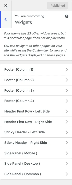
Section titled “Side panel widgets”The side panel content comes from three widget areas in Appearance › Widgets, also listed in the Widgets panel of the Customizer:
- Side Panel (Desktop): shows only on desktop screens, wider than 1024px.
- Side Panel (Mobile): shows only on mobile screens, up to 1024px wide.
- Side Panel (Common): shows on all screen sizes.