Navigations
WordPress menus
Section titled “WordPress menus”How menus work in NaturaLife
Section titled “How menus work in NaturaLife”WordPress lets you build your own menus. A menu is a list of items, such as pages, posts, categories and links, that you drag and drop into place. You then assign the menu to one of the theme’s menu locations. For example, you create a menu called “My main navigation” and assign it to the Main Navigation location. Your menu then shows in the header, where the theme places the main navigation.
How to create a menu, add items and custom links, nest items into submenus and assign a location is explained step by step in Create a menu and assign it to a location. This page covers what is specific to NaturaLife.
Menu locations
Section titled “Menu locations”NaturaLife has three menu locations:
- Main Navigation: the main menu in the header. It supports submenus, subtitles, icons and the multi-column menu.
- Footer Navigation: the menu above the copyright text in the footer.
- Mobile Navigation: a menu for mobile screens only. If you leave it empty, the main navigation is used on mobile screens.
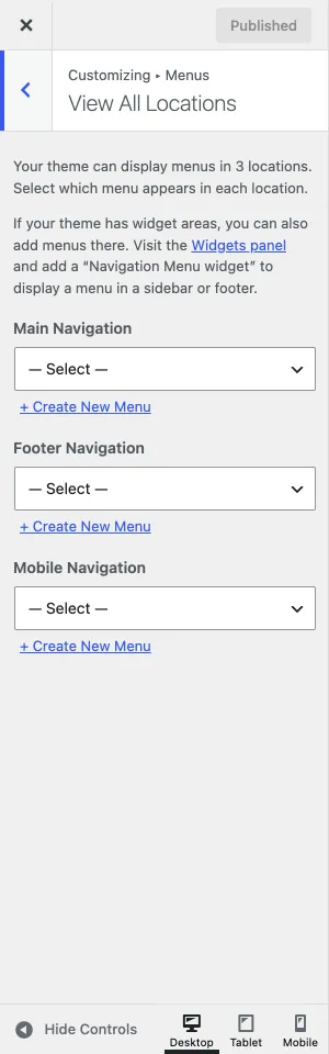
The demo content comes with a “Main Navigation Menu” for the main navigation location and a “Footer Navigation Menu” for the footer location. You can also create menus with your own names and assign them to the theme’s menu locations. One menu can be assigned to several locations. Not every location supports submenus, though: the footer location shows top-level items only and does not display any dropdown menus.
Menu subtitles
Section titled “Menu subtitles”NaturaLife supports subtitles for the Main Navigation location. You add a subtitle in the Description field of a menu item. If you do not see the Description field, open Screen Options at the top right of the Appearance › Menus screen and tick Description. The field then appears in every menu item.
Mobile navigation
Section titled “Mobile navigation”The mobile menu is not the same as what you see when you make your browser window narrower on a computer. It looks different from the desktop menu, and it lives in the side panel. To show a different menu on mobile screens only, assign it to the Mobile Navigation location. See Side Panel for the mobile menu settings.
Where to find the menus
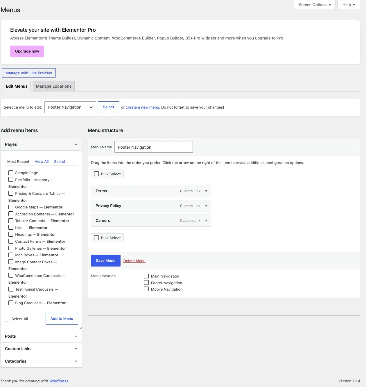
Section titled “Where to find the menus”Go to Appearance › Menus. Here you select a menu to edit or create a new one, add items from the boxes on the left, and choose the menu’s display location under Menu Settings.
Building a menu
Section titled “Building a menu”- Go to Appearance › Menus, select a menu from the dropdown and click Select, or click create a new menu.
- Add pages, posts, categories, portfolio items or custom links from the boxes on the left.
- Drag the items into order. Drag an item to the right, under another item, to make it a submenu item.
- Under Menu Settings, tick the display location. You must assign a location, or the menu does not appear on your site.
- Click Save Menu, then visit your site to check the result.
Each menu item has settings of its own: the navigation label, the title attribute (shown when someone hovers over the item), the description and CSS classes. If some of them are missing, turn them on in Screen Options.
Adding an icon or a subtitle to a menu item
Section titled “Adding an icon or a subtitle to a menu item”- Icon: click in the CSS Classes field of the menu item (1). A pop-up opens with the available icons. Click the icon you want.
- Subtitle: type the text in the Description field (2).
If you do not see these fields, turn on CSS Classes and Description in Screen Options while you are on the menu screen.
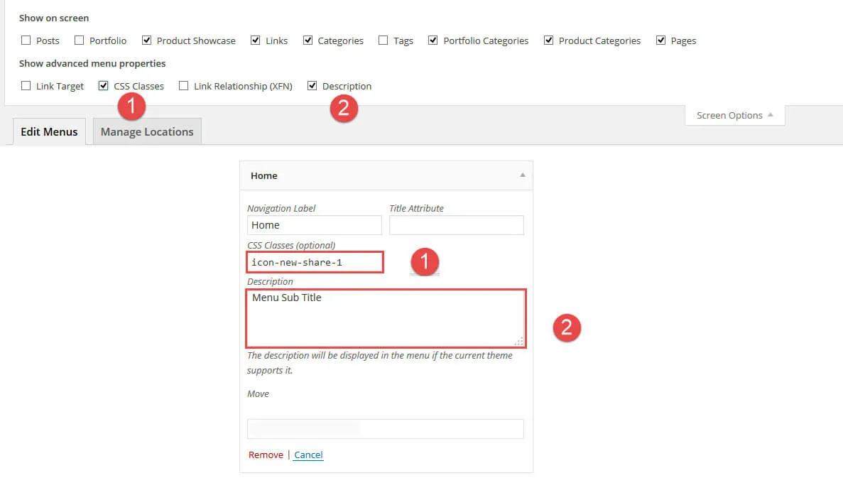
Showing categories in the menu screen
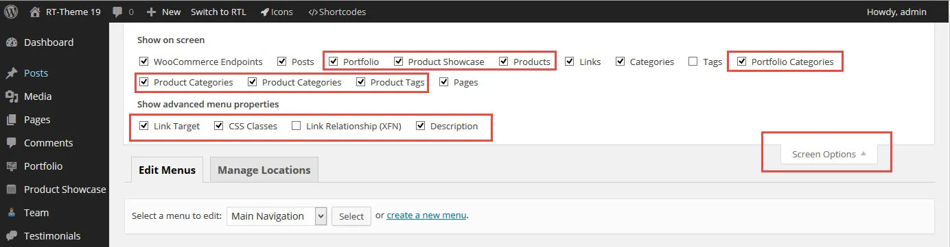
Section titled “Showing categories in the menu screen”If you do not see the portfolio, product or post categories on the left of the menu screen, they are hidden in Screen Options.
-
Open Screen Options at the top right of the screen.
-
Tick the post, product and portfolio categories. They then appear on the left of the menu screen, and you can add them to your menu.
Adding a home page or a custom link
Section titled “Adding a home page or a custom link”Use the Custom Links box on the left: enter the URL, enter a label such as Home in Link Text, and click Add to Menu. Then drag the new item into place and save the menu. See Create a menu and assign it to a location for the details.
Multi-column navigation (mega menu)
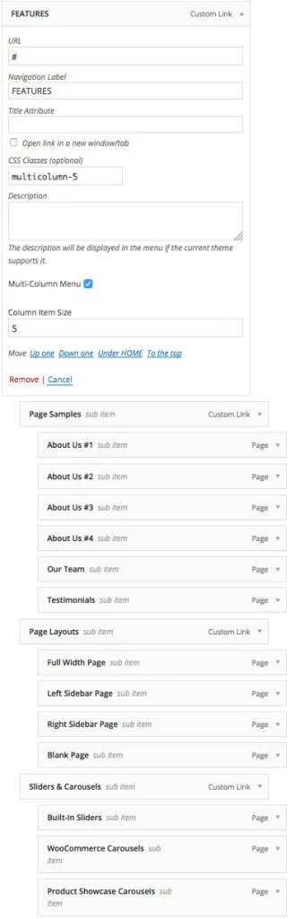
Section titled “Multi-column navigation (mega menu)”You can turn a dropdown menu into a multi-column menu. Each menu item has a Multi-Column Menu checkbox. This works only for top-level items. Once you tick the box, the submenu items show in columns, and a Column Item Size field appears. In the demo menu below it is set to 5, one for each column.
The screenshot shows the “Features” menu of our demo. We built it from third-level menu items, grouped under five second-level items. A second-level item becomes a column title when it has a submenu. On mobile screens, multi-column menus show as regular menus.